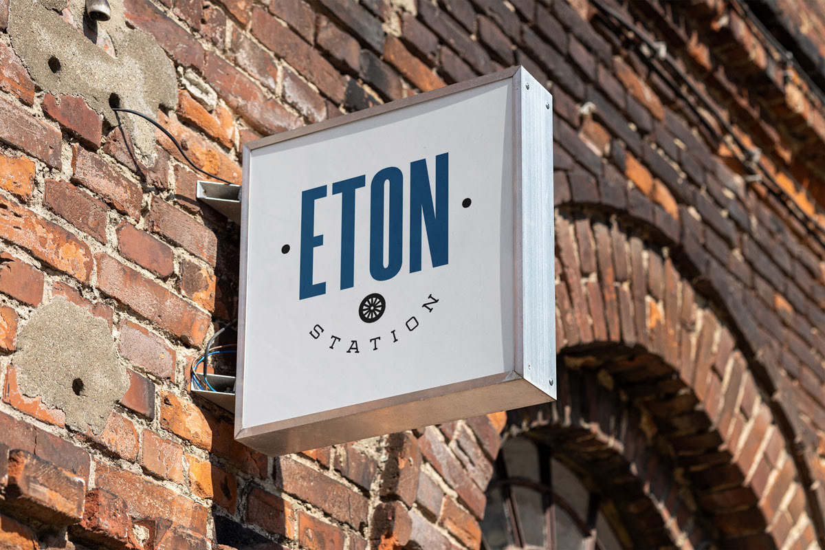
Following the redevelopment of a landmark building in one of Birmingham’s boutique districts, I was tasked with crafting a new brand identity tailored to attract high-end medical tenants. The challenge: create a visual system that honors the building’s historic roots—perched along a former train route—while resonating with today’s modern, health-focused professionals.
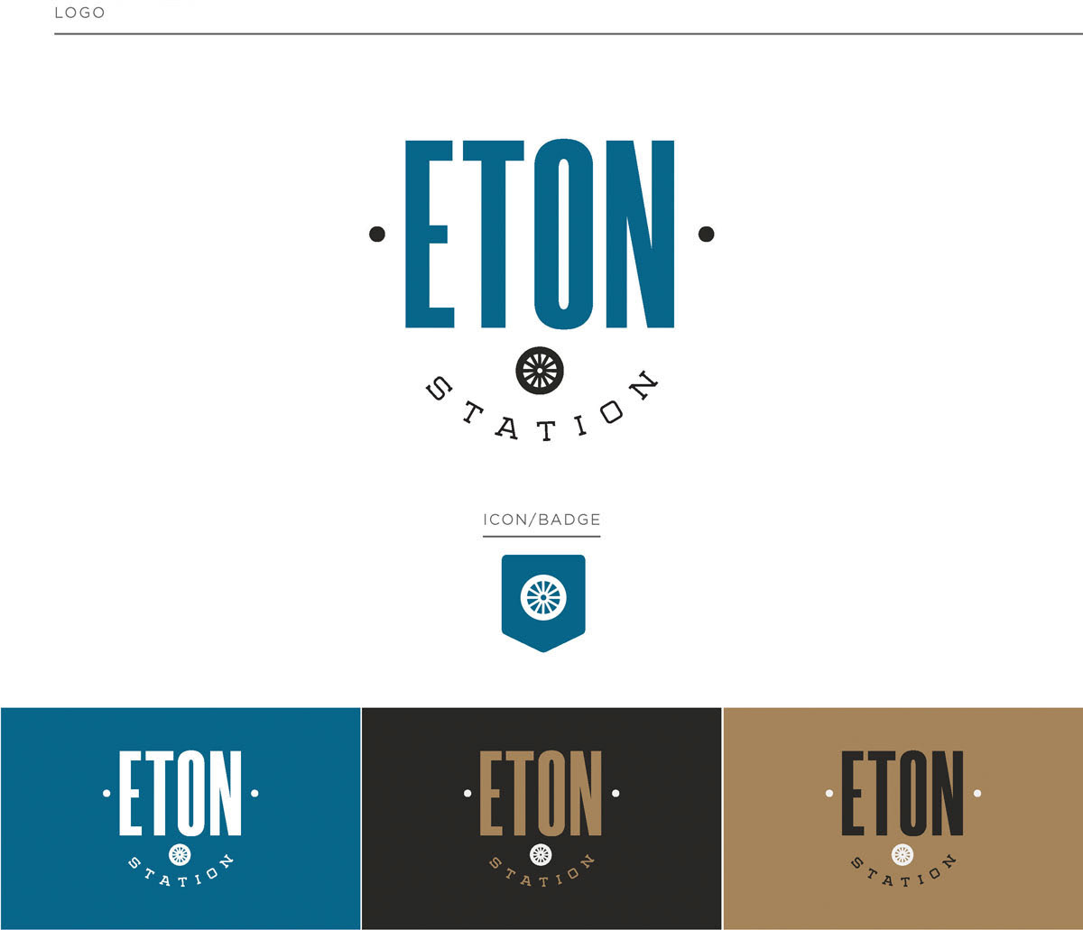
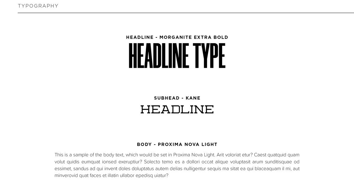
The final identity bridges eras through thoughtful design. A bold, clean headline typeface contrasts with a slab serif subhead, creating a balance between contemporary sensibility and heritage charm. A custom steam train wheel icon subtly nods to the site’s rail legacy, tying in the past without overpowering the present.
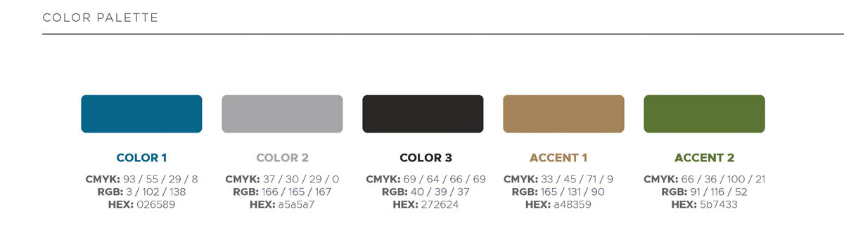
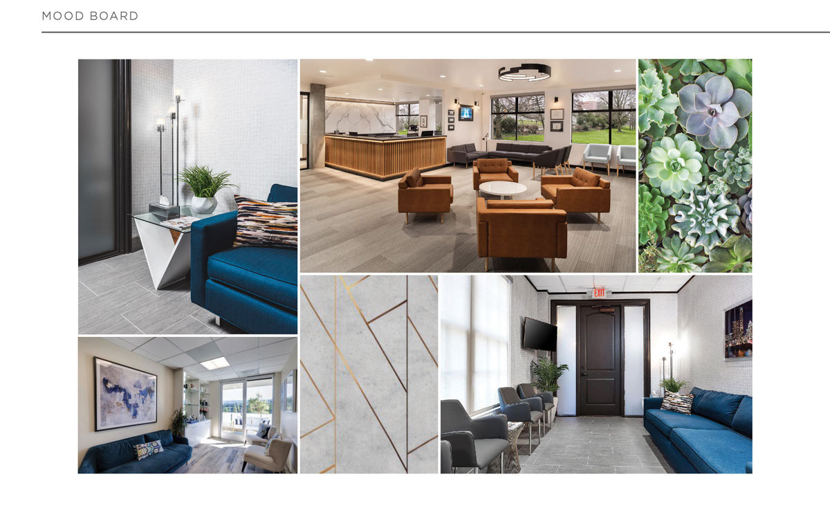
Color plays a key role: the primary teal blue offers a fresh, refined take on the traditional medical palette, while bronze and charcoal accents—drawn from the building’s luxe interior finishes—bring warmth and sophistication. The result is a brand that’s grounded in history, yet designed for a forward-looking professional audience.